You stay
foxy, Internet


Usable websites that keep the end user in the driver's seat
Fluid-width design that looks foxy on any screen size
Determining business goals while identifying customer needs
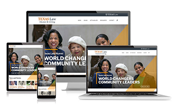
The Texas Law alumni website needed more functionality and flexibility for its content owners. I designed a fresh look while adhering to the design system we built for the law school. My team and I coded new page templates and custom fields in WordPress for content editors to easily enter information, news, and resources while creating their own page layouts. One year prior to the start of this project, I conducted user research and interviews to understand how Texas Law alumni engaged in digital information as well as their preferences on digesting news and materials provided by the law school.
Requirements and Features
Role: Designer, Developer, UX
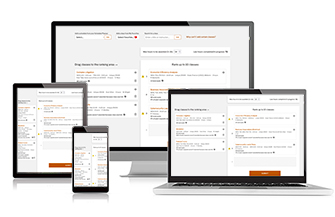
Texas Law's previous Early Registration system was a mainframe-based application that provided little help for students navigating its archaic interface and rules. My main role was to determine a workflow and interface that allowed law students a straightforward way to decide class request rankings, review potential time conflicts, and understand registration result decisions.
Requirements and Features
Role: UX, Designer, Developer, Project Management
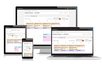
For many years, my team and I heard from law students that they needed a better way to plan their class schedules each semester. From custom Excel charts to intense Google Calendars, students used a variety of labor-intensive methods to block out a visual, weekly time schedule. Our new Schedule Planner allows law students to easily add classes directly from their favorited classes or the course schedule. This tool also includes time conflict warnings, a visual final exam schedule, short-courses, and a way to load planned schedules into the law school's Early Registration system.
Requirements and Features
Role: UX, Designer, Developer
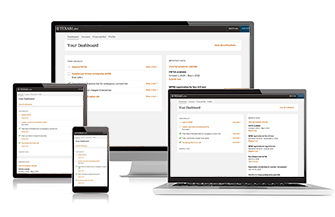
While interviewing students to understand how their admission processes went, I learned students needed a centralized place to carry them from admissions to becoming a current student. I spoke with current students to understand their pain points in law school, and from there, we defined the requirements for a new student dashboard to serve applicants all the way from admissions to graduation. We broke the project down into two phases: Admissions and Current Students. I conducted several rounds of student discussions and testing during both development phases. A year after the application launched, I surveyed students for improvements.
Requirements and Features
Role: UX, Designer, Developer
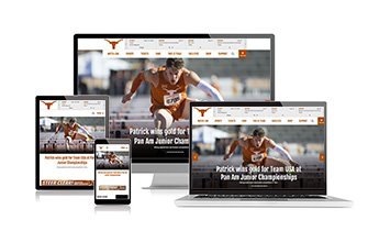
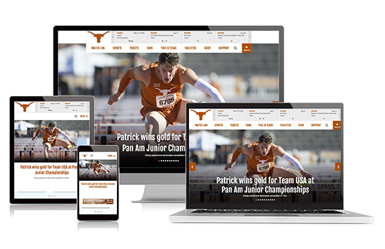
As project manager for this redesign, I allocated nine months for the completion of this project. With a strict timeline, we implemented a UX approach by conducting user surveys, focus groups, and task-based user testing. I met with every sport program and various departments to ensure internal needs were met while collaborating with external clients for additional business needs, such as ad spaces. We created a marketing plan for pre and post launch that included social teasers, animated gifs, screen grabs, and other video components.
Requirements and Features
Role: Project Manager, UX
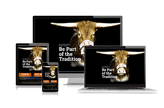
This microsite served as a central hub to direct fans and ticket sales reps for all information regarding football season ticket purchases. I collaborated with various departmental areas for content and requirements while implementing a design with Bevo XV, who had recently made his public debut. A single-scroll page was desired, as this site would be heavily viewed on mobile due to an email marketing campaign periodically sending links to this site.
Requirements and Features
Role: Project Manager, Designer, Developer

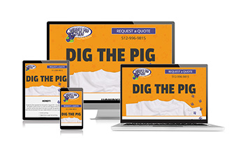
This T-shirt printing company needed a simple, online presence to provide clients with basic information and a way to request an online quote. I added text animation and scroll reveal animation of pig tracks walking down the page to guide users to other areas of content. The owners are fun and crazy and wanted a site to reflect their personalities.
Requirements and Features
Role: Project Manager, Designer, Developer
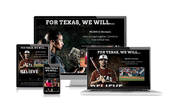
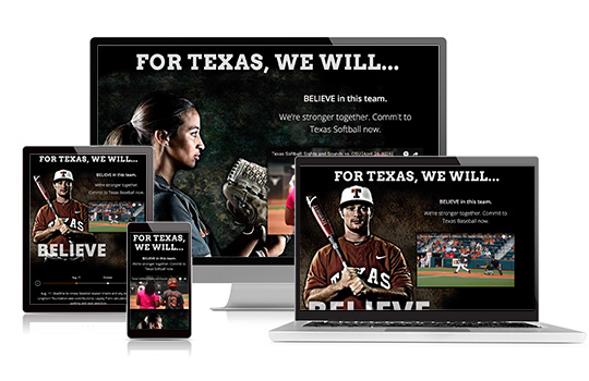
These microsites served as central hubs to direct fans and ticket sales reps for all information regarding softball and baseball season ticket purchases. I collaborated with various departmentals for content and requirements and implemented a design with a dark and stylized look, adhering to the departmental standard at the time. A single-scroll page was desired, as these sites would be heavily viewed on mobile due to an email marketing campaign.
Requirements and Features
Role: Project Manager, Designer, Developer
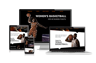
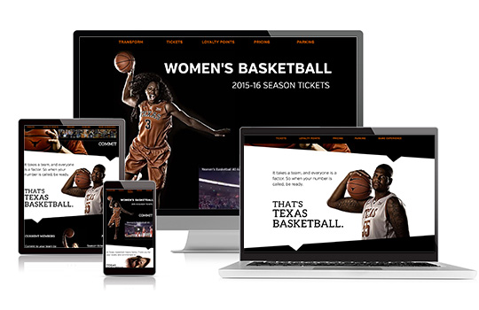
These microsites served as central hubs to direct fans and ticket sales reps for all information regarding men's and women's basketball season ticket purchases. I collaborated with various departmentals for content and requirements and implemented a design with a dark and stylized look, adhering to the departmental standard at the time. A single-scroll page was desired, as these sites would be heavily viewed on mobile due to an email marketing campaign.
Requirements and Features
Role: Project Manager, Designer, Developer
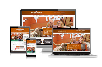
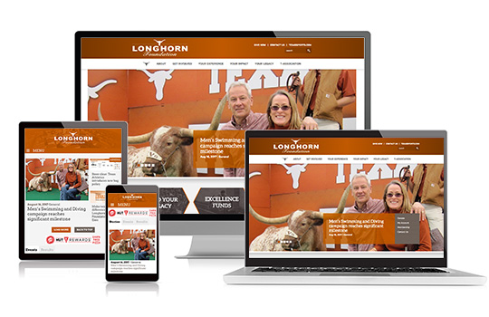
The Longhorn Foundation decided to separate their online presence from the departmental site in order to have more flexibility and present their philanthropic values. I facilitated this website through the stages of concept, design, and testing.
Requirements and Features
Role: Internal Project Manager
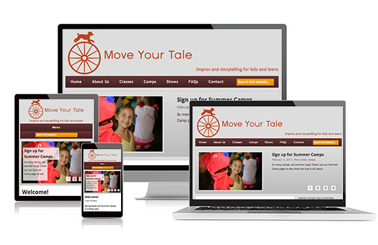
Move Your Tale is a group that provides kids improvisation classes for young kids and young adults. This group needed a web presence on a low-budget (okay, I did it for free) and needed a way for parents to register and pay for classes and summer camps. The owner wanted the ability to update the website, so I created a WordPress site and added the needed plugins for her. Once the site was ready, I trained her in the WordPress CMS so she would be self-sufficient.
Requirements and Features
Role: Project Manager, UX, Designer, Developer

More examples available upon request.
I, Melanie Lindahl, am Curious Fox Design.
Located in Austin, Texas, I love being a web dork and creating cool stuff (who doesn't, right?).
Hey, I have an idea, let's foxify your website into something you and your clients will adore. Sound good? Cool, shoot me an email or submit the web form so we can get started.
Being an artist allows me to design something beautiful, groovy, (insert cool adjective here). Being an adorer of user behavior and a full-time dork allows me to have a blast determining features and coding your website. This is what I do, and I love it.
Now let me get back to work, will you?
Why don't you just email me, yeah? melanie@curiousfoxdesign.com
Or message me on LinkedIn.
Talk soon!